Spotify today announced it’s rolling out a new look for its streaming service on the desktop, with the launch of a redesigned app for both Mac and Windows, as well as an updated web app. The changes, which will be made available to all global users, focus on improving the navigation and providing users with access to new controls and features across playlists, search, radio, their queue, library, and more.
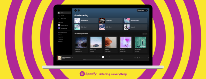
Overall, the update gives the Spotify app a more streamlined, less cluttered look and feel, compared with the prior version.

Image Credits: Spotify
One notable change is that the new app does away with the oddly placed search bar that was previously found at the top left of the screen. Now it’s been relocated to the slimmed down navigation bar on the left side, in between the links for Home and Your Library.
The app also no longer details the various destinations within Your Library within this navigation bar — like Made For You, Recently Played, Albums, Artists or Podcasts, for example. Instead, you’ll have to click into your Library section to view these selections.
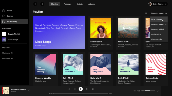
Now, the Your Library page will feature four categories across the top of the page, starting with Playlists, where you’ll find your Liked Songs, Discover Weekly, Daily Mixes, Release Radar, and more. Playlists is followed by different sections for browsing Podcasts (which got bumped up to the No. 2 spot in the update! hint hint!), then Artists and Albums.

Image Credits: Spotify
A new dropdown menu in the Your Library lets you further sort these various sections in a variety of ways: by Most Relevant, Recently Played, Recently Added, Alphabetical, or even by a Custom Order you can configure.
Meanwhile, those who like to build playlists will gain a handful of new features in the updated app.
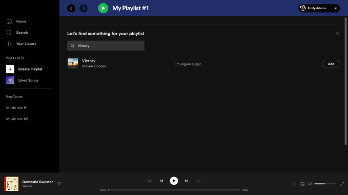
They can now write descriptions, upload their own images, and drag and drop tracks into existing playlists. They can also use a new embedded search bar located at the top of the “Create Playlist” page to seek out new songs or even podcast episodes to add to the playlist. This could greatly speed up the somewhat tedious process of playlist creation, by reducing the steps it takes between finding a track and getting it into a playlist.

Image Credits: Spotify
This change in particular speaks to Spotify’s growing interest in catering to curators — something co-founder and CEO Daniel Ek mentioned during his recent appearance on the PressClub show on Clubhouse.
Ek explained that he was “excited about curatorship” because when a service’s content library grows, it needs curators.
“The playlisters are incredible on Spotify, but it seems like there’s limited ability to interact with those playlisters — or for those playlisters to really understand who is listening to them and be able to build that second set of creators [who] are indirectly creating by helping other people find content to experience,” he said.
To address this challenge, Ek said Spotify would try to add more tools to allow users to become better curators, if not on a social basis, at least for themselves.
“The primary focus for us on the roadmap is just enabling you to be a much better curator even for yourself — just by, for instance, suggesting content that’s relevant to the things you’ve already put in the playlist,” he added.
These updated playlist creation tools seem like a natural first step towards Spotify’s larger goals in this area.

Image Credits: Spotify
A few other changes in the updated apps include a refreshed listener profile page which now features both your top artists and top tracks; a new way to start a radio session for any song or artist via the three-dot (“…”) more menu; and the ability to now edit your Queue and view your Recently Played items on the Desktop app.
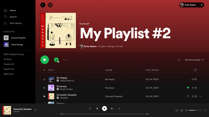
Premium subscribers gain another perk, too: they’ll be able to download music and podcasts to listen to offline, via a download button in the Desktop app.
In a blog post announcing the changes, Spotify admitted that it hadn’t quite kept up with the development of its desktop app as its service had grown, and today’s launch is an attempt to correct that.
“At Spotify, we’re always looking for ways to provide the best possible experience so our listeners can consistently discover and enjoy music and podcasts—and that includes look, feel, and functionality. We constantly test, develop, and launch new features, optimize for new devices, and look to expand our content offering,” the post read. “Yet along the way, we felt that our desktop app experience hadn’t kept up, and that it was time for a change.”
The updated apps for Mac, Windows and the web are rolling out starting today.


