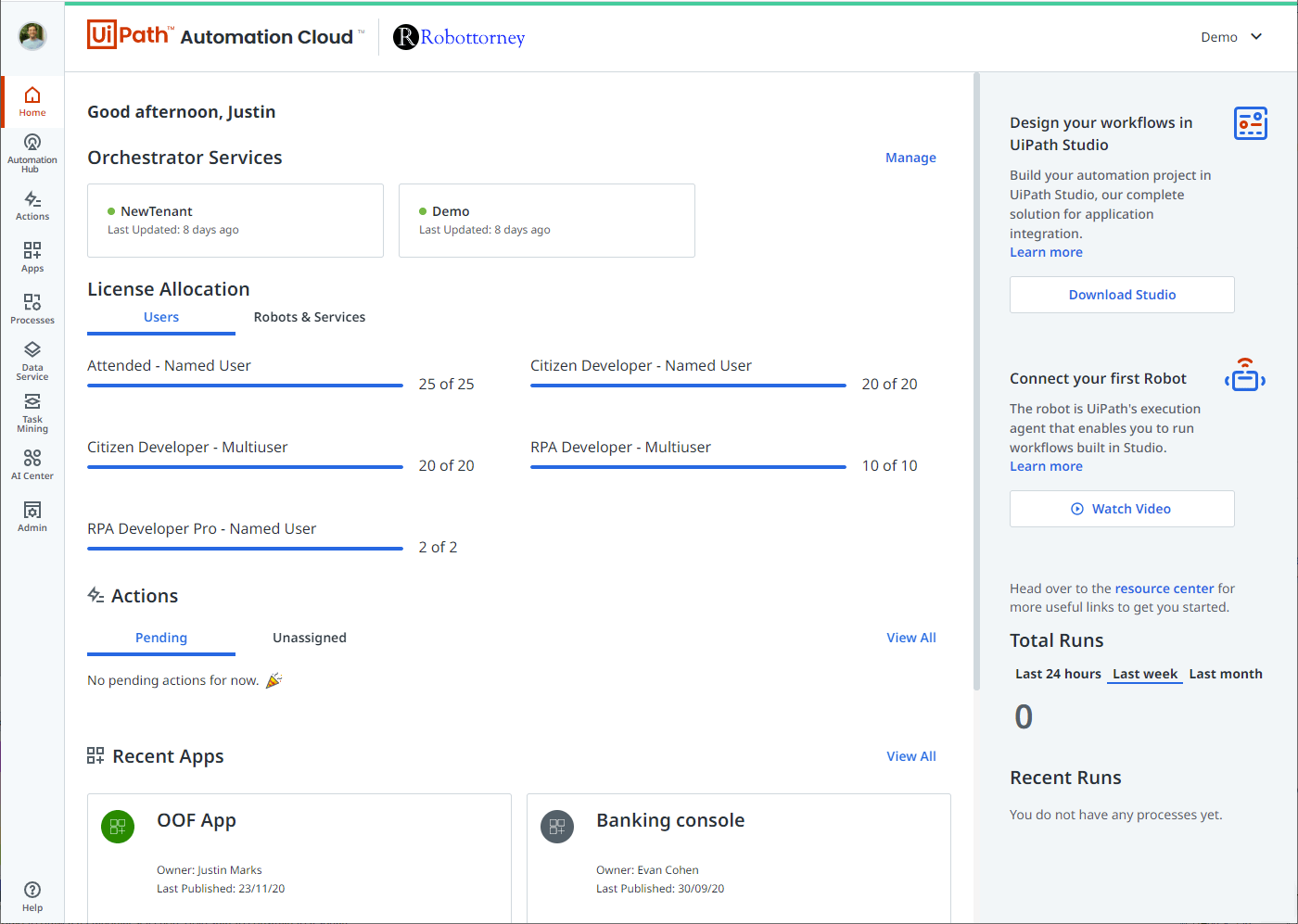
Over the past couple of years, we’ve seen the number of products from UiPath grow from three to over 20! With this rapid growth, we realized that our customers would benefit from a design system to keep our experiences simple to use and easier to develop.
Like all the best design systems, we had to come up with a catchy name. Seeing as how it was created near the 50th anniversary of the moon landing and building a comprehensive design system can feel like a moonshot no matter how prepared you are, we call our system Apollo.
You might be asking, what is a design system, and why should I care?
The Apollo design system is a collection of objects (controls in many cases) that allow us to provide UiPath customers the best possible experience across all of our products. Guided by clear standards, we assemble these components to create any number of products. We believe that a good design system brings critical value to you.
Consistency
Apollo ensures that things you’ve learned in one product transfer to another easily with a design system. Products that are easier to understand help lower the cost of ownership and make you and your employees more effective.
Development efficiency
Recreating controls one or two times is inefficient, five or more is ridiculous. Redundant development is an easily calculated value, and the costs are enormous. By developing new products and features more efficiently, we are even more responsive to your needs and can deliver new features to you more quickly.
Quality
Better quality for you, our customers, means it’s easier to recognize the value of the products without the frustration of unnecessary bugs and distractions.
Identity
Creating this consistent and well-thought-through system is a cornerstone of our products. This cohesive experience helps communicate return on investment to your leadership.
Creating the Apollo design system with you in mind
From naming the design system, we fast forward to March 2020. We began our journey to release our new design system to you, our customers, with the release of Automation Cloud™. We intended to create an experience that was both modern and usable while improving our ability to engineer the UiPath Platform quickly.
We developed our design system on the foundation of Material Design. This allowed us to standardize our visual language on a solid, well-tested implementation that was fully accessible while improving our ability to create experiences quickly.
After the introduction of Automation Cloud™ last year, we’ve been slowly rolling out the design system across the platform. We’ve significantly increased the number of products in our platform through our own development and acquisitions so that you can become a fully automated enterprise™. As you expanded your usage from UiPath Orchestrator to our entire suite, we needed to provide a navigation mechanism to switch easily between products while creating a consistent experience.

Apollo is being applied to all parts of the UiPath Platform, from our web experiences like Apps and Orchestrator, to our client tools like Studio and Assistant.
Our key goals continue to be:
- Improve usability with a humble and well-researched approach that listens to you, our customers.
- Build a modern design system that continues to support the future of UiPath while being beautiful and a joy to use.
- Provide for easy discovery and use of our automation tools unobtrusively, letting you get your work done.
Coming soon…
As always, look to the release notes to learn more about what we deliver each sprint. To whet your appetite here’s a list of some of the design system features you’ll see come to life across Automation Cloud. And for those of you that deploy our product on-premises, you’ll be seeing these same features in upcoming releases. UiPath Chief Product Officer (CPO) Param Kahlon also shared Automation Cloud updates in his 2021.3 Monthly Update.
Unified, context-aware header
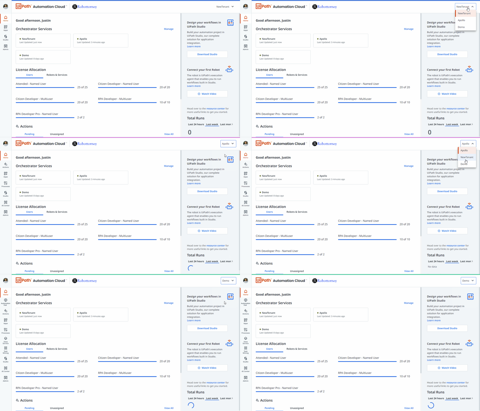
As customers expand their use of UiPath to multiple products and tenants across their enterprise, we’ve heard consistent feedback that they need a better way to know where they are simply at a glance. Our new header will make it easy to see not only what product you’re using but also what organization and tenant you’re in the context of.

Administrators can customize the header with a logo and tenant color, providing users a consistent way to know your account and tenant context across all services.
Dark theme support
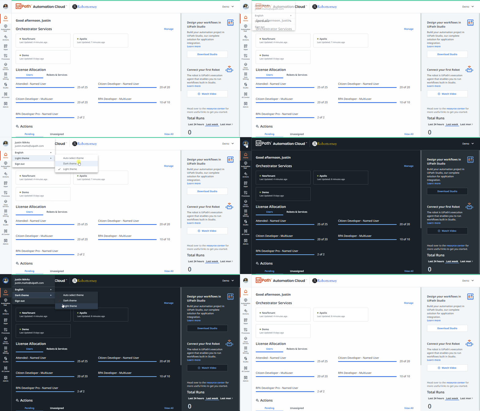
Following the trend across the industry, we will provide the ability for users to switch between light and dark themes. Dark themes make it easier for readability, improve battery life, and help us achieve our accessibility support goals. Not to mention, some users just think it’s cool.

Users will be able to choose between a light and dark theme in both the web as well as client experiences.
As always if you have thoughts, good or bad, about the experience, we’ve love to hear them through the UiPath Forum. We are here to make your UiPath experience better and easier.
This article was co-authored by Justin Marks, Principal Product Manager at UiPath.


